


What is Frequency
What do Glasgow, Reykjavik, Dublin, Brussels and Hamburg have in common? All of these cities, despite being located in different countries across Europe, made it onto Statistica’s list of the continent’s “gloomiest cities” in 2016.
Using sunlight as a marker for gloominess, all of these cities are amongst 10 scattered around Europe that receive the lowest average hours of sunshine annually. While many individuals actually prefer a lack of sunshine, this statistic is a perfect example of one of the most powerful concepts in the field: frequency.
Frequency is defined as the number of times any event has occurred. Sounds simple - well, that’s because it is! The simplicity of frequency is what makes it such a useful tool in making sense of phenomena that can be extremely complicated otherwise.
There are three different ways you can calculate frequency, summarized in the table below.
| Type | Description | Example | Calculation |
| Simple Frequency | Describes how many times something occurs | There are five 10 year-olds, ten 11 year-olds, three 12 year-olds and two 13 year-old in a classroom | The total count of students in the class: 20 students |
| Relative Frequency | Is the percentage of times something occurs over the total | The relative frequency of each age in the classroom | 5/20 = 0.25 10 year-olds 10/20 = 0.5 11 year-olds 3/20 = 0.15 12 yo 2/20 = 0.1 13 yo |
| Cumulative Frequency | Is the sum of the relative frequency | The cumulative sum of each age in the classroom | 0.25+0.5 = 0.75 10 and 11 yo 0.75 + 0.15 = 0.9 10, 11 & 12 yo 0.9 + 0.1 = 1 |
Simple frequency can be calculated by simply counting the number of times an event occurs. Frequency, as you can see by our first example, can be calculated as hours, days or a simple count.
Relative frequency, on the other hand, is the proportion of times something occurs compared to the total frequency. For example, out of 20 side-dishes on a restaurant menu, if rice is featured 5 times, the relative frequency of rice would be:
[
dfrac{5}{20} = .25
]
Cumulative frequency is found by adding each previous event’s frequency. Using the same example, if bread was present in 10 side dishes, the cumulative frequency of rice and bread would be:
[
dfrac{10}{20} = .50
]
[
.25 + .50 = .75
]
Frequency can also be thought about as row and column frequency, which are both two types of relative frequencies. Take the table below as an example of favourite colours by gender.
| Gender | Blue | Green | Yellow | Total |
| Female | 30 | 10 | 10 | 50 |
| Male | 20 | 15 | 15 | 50 |
| Total | 50 | 25 | 25 | 100 |
The row frequency would be calculated as the relative frequency of each colour by gender. The table below represents the calculation of row frequencies. The first entry is calculated as 30 divided by 50, which is the row total, and yields 0.6, or 60%. This means that 60% of females have blue as their favourite colour in this sample.
| Gender | Blue | Green | Yellow | Total |
| Female | 60% | 20% | 20% | 100% |
| Male | 40% | 30% | 30% | 100% |
| Total | 50% | 25% | 25% | 100% |
The column frequency, on the other hand, is calculated as the relative frequency of each gender by colour. The table below represents the calculation of column frequencies. The second entry in the first row is calculated as 10 divided by 25, which is the column total, and yields 0.4, or 40%. This means that 40% of all people who prefer green in this sample are females.
| Gender | Blue | Green | Yellow | Total |
| Female | 60% | 40% | 40% | 50% |
| Male | 40% | 60% | 60% | 50% |
| Total | 100% | 100% | 100% | 100% |
What is a Bar Chart
When it comes to understanding important information, sometimes numbers just don’t cut it. This is where data visualizations, or visual representation of statistics, come in. There are a number of ways frequency can be displayed - here are some of the most common.
Histogram
Histograms are graphs that represent the zsx of a variable. They do this by displaying the frequency of each observation. This can be particularly helpful when you’re interested in understanding what your data look like.

You can read the histogram above by taking the first bar. About 3 people are between 5 and 10 years old.
Bar Chart
Bar charts are another way of displaying the frequency of an event. The main difference between it and a histogram is that it is used for categorical, or qualitative, variables while histograms are used for numerical, or quantitative, variables.
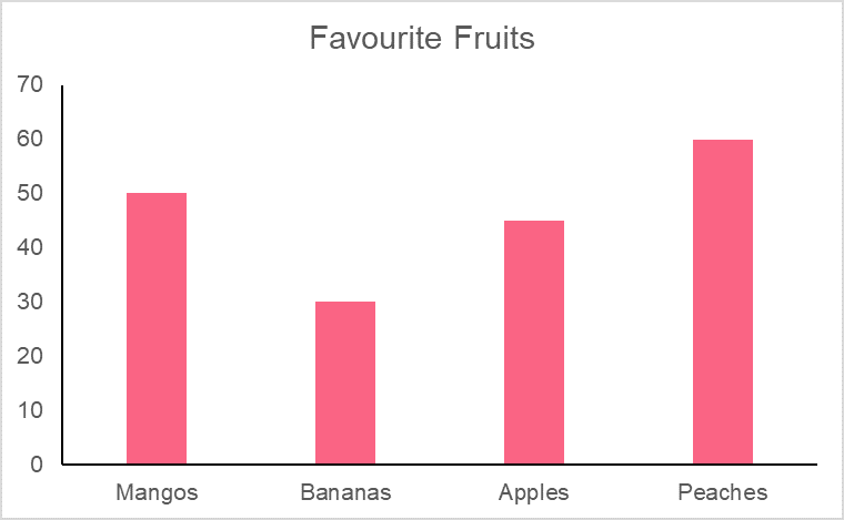
You can read this bar chart by looking at the first two bars. The number of times people say their favourite fruit is mango is higher than for bananas, which is shown here as relative frequencies.
Pie Chart
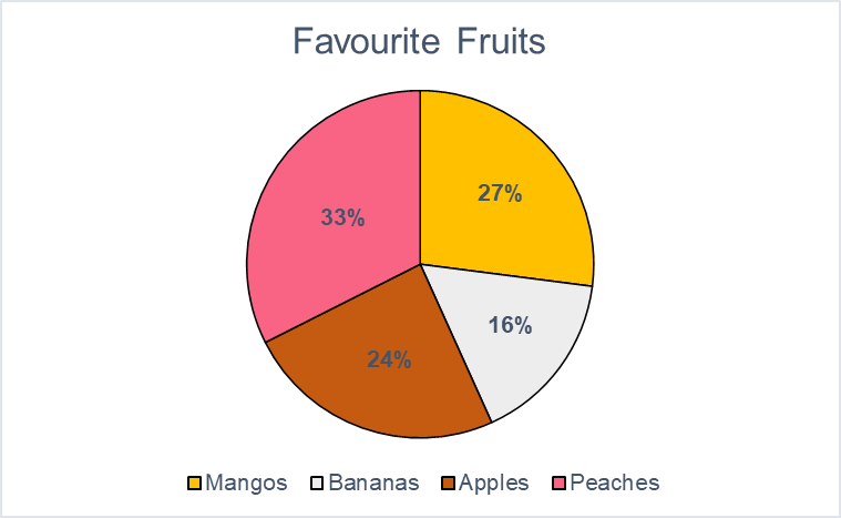
Pie charts are the third most common representation of frequency. Each slice of a pie represents a proportion of the total. Pie charts are also used for categorical, or qualitative, variables. Like pie charts, the frequency can be displayed as both a percentage or a simple count.
You interpret this pie chart by looking at the pink slice. This shows the frequency as a count and a percentage, which is the proportion of the total number of whole.
Problem 1
You have data on 10 cities throughout Europe, including the name and country of the city. Each city has the number of hours of sunshine they receive annually. Determine which 3 cities receive the most sunshine and calculate their cumulative frequency.
| Country | City | Frequency |
| Bulgaria | Sofia | 2,177 |
| Croatia | Zagreb | 1,913 |
| Georgia | Tbilisi | 2,046 |
| Greece | Athens | 2,773 |
| Italy | Cagliari | 2,726 |
| Malta | Valletta | 3,054 |
| Montenegro | Podgorica | 2,481 |
| Portugal | Porto | 2,468 |
| Serbia | Belgrade | 2,112 |
| Spain | Valencia | 2,696 |
Problem 2
The following table contains information about the number of people who voted for a given proposition by party affiliation. Calculate row and column frequency of the data and graph each statistic.
| Proposition | Purple Party | Green Party |
| Proposition A | 13 | 54 |
| Proposition B | 60 | 20 |
| Proposition C | 27 | 26 |
Problem 3
The following table contains information on sports events and the number of online viewers. Build a pie chart out of the data using the appropriate frequency.
| Event A | Event B | Event C | Event D | |
| Viewers | 1 000 | 20 000 | 5 000 | 3 000 |
Solution Problem 1
In order to identify which 3 cities receive the most sunshine, we simply have to compare the frequencies between each. First, we reorder the cities in order from most to least hours of sunshine, then calculate their relative frequencies.
| Country | City | Frequency | Relative Frequency |
| Malta | Valletta | 3,054 | 3,054/24,446 = 12.5% |
| Greece | Athens | 2,773 | 2,773/24,446 = 11.3% |
| Italy | Cagliari | 2,726 | 2,726/24,446 = 11.2% |
| Spain | Valencia | 2,696 | 11% |
| Montenegro | Podgorica | 2,481 | 10.1% |
| Portugal | Porto | 2,468 | 10.1% |
| Bulgaria | Sofia | 2,177 | 8.9% |
| Serbia | Belgrade | 2,112 | 8.6% |
| Georgia | Tbilisi | 2,046 | 8.4% |
| Croatia | Zagreb | 1,913 | 7.8% |
| Total | 24,446 | 100% |
To calculate the cumulative frequency, we simply add the top three cities together:
[
12.5% + 11.3% + 11.2% = 35%
]
Interpreting this number, this means that the top three cities on this list receive more than a quarter of the total hours of sunshine of all cities.
Solution Problem 2
First, in order to calculate the row and column frequencies, you have to calculate the totals of each row and column.
| Proposition | Purple Party | Green Party | Total |
| Proposition A | 13 | 54 | 67 |
| Proposition B | 60 | 20 | 80 |
| Proposition C | 27 | 26 | 53 |
| Total | 100 | 100 | 200 |
The row frequencies are found below, along with an example chart.
| Proposition | Purple Party | Green Party | Total |
| Proposition A | 19% | 81% | 100% |
| Proposition B | 75% | 25% | 100% |
| Proposition C | 51% | 49% | 100% |
| Total | 50% | 50% | 100% |
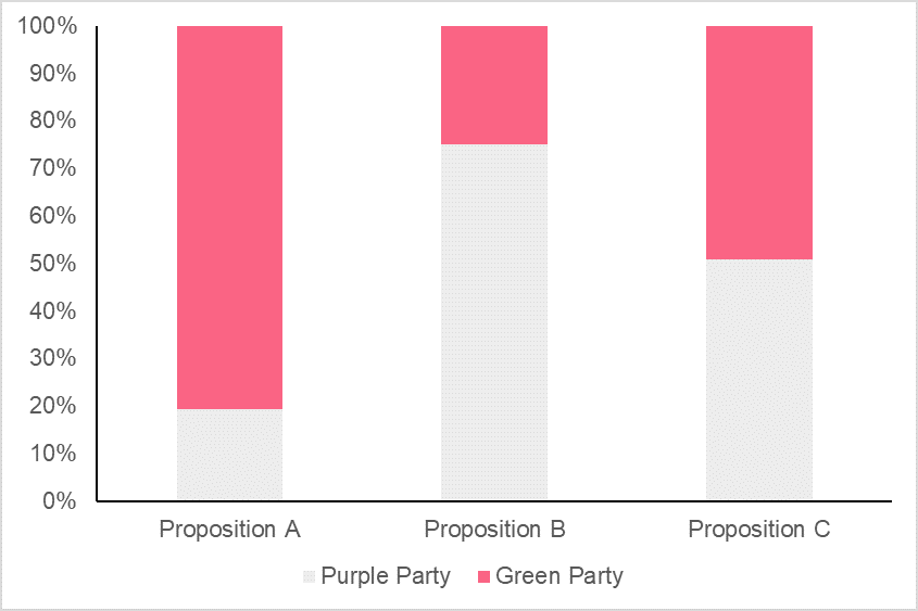
The column frequencies are found below, along with an example chart.
| Proposition | Purple Party | Green Party | Total |
| Proposition A | 13% | 54% | 34% |
| Proposition B | 60% | 20% | 40% |
| Proposition C | 27% | 26% | 27% |
| Total | 100% | 100% | 100% |

Solution Problem 3
First we calculate the relative frequencies, found below, and graph them.
| Event A | Event B | Event C | Event D | |
| Viewers | 1 000/30 000 = 0.03 | 20 0000/30 000 = 0.67 | 5 000 0/30 000 = 0.2 | 3 0000/30 000 = 0.1 |

Summarise with AI:
Did you like this article? Rate it!


 Loading...
This is the best!
Hi! Thanks for taking the time to comment, we’re glad that you found these exercises helpful :)
useful lessons
Thanks for taking the time to comment! We’re glad you found this resource useful.
Can you help me answer my activities